Lists and grids
 |
Summary:
|
Java
Related design guidelines |
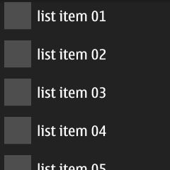
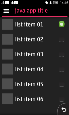
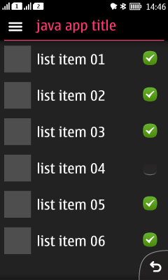
Lists contain one row textual items, with optional additional icons and/or interactive buttons. In general, informative icons should be displayed to the left of the text and selection indicators (Check box, Radio button) on the right. The icon positions and selection indicators are mirrored for right-to-left languages.
With touch down a highlight is shown to the list item. With touch release the highlight disappears, and the action is triggered. With Check boxes, when the user taps on the box, it changes its state to On/Off. With Radio buttons tapping the indicator selects the item, and unselects the previous selection.
You can only use one list item type (plain, Radio button, or Check box) for each list.
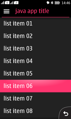
| Plain list | |
|---|---|
Figure 1. Plain list showing highlight on item 6
 |
|
| List with icons | |
|---|---|
Figure 2. List with icons
|
|
| List with Radio buttons | |
|---|---|
Figure 3. List with Radio buttons
 |
|
| List with Check boxes | |
|---|---|
Figure 4. List with Check boxes
 |
|
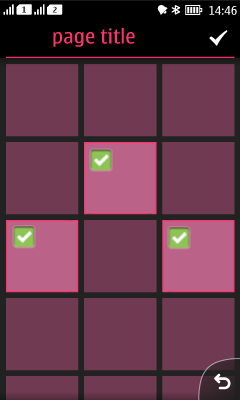
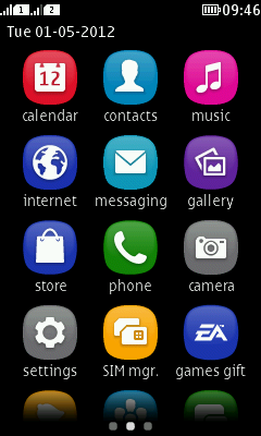
Grids
A list can be presented in the form of a grid as well; it's just a more graphical way of organising the information. There is no component or API available for creating a grid layout. Examples of grid layout can be found from the App launcher and the Gallery. A grid layout can be achieved by using Canvas.
